In 2023, the internet emits more CO₂ than the aviation industry, yet 96% of websites remain hardly accessible.
In 2021, Codi.pro committed to a mission: to mitigate the internet's negative impact on the real world. Witnessing the web’s incredible waste of resources and potential, we decided to join the front of change. Here's why we chose to act and what we do to make a difference.
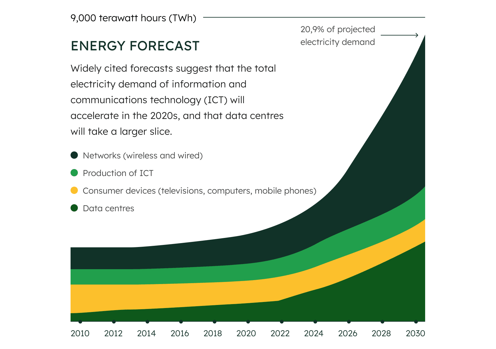
By 2030, internet tech will consume 21% of global electricity.
In 2022, internet use was responsible for approximately 3% of the world's total greenhouse gas emissions (equivalent to 1.6k million of a total of 53.8k million metric tons CO₂). That’s 50% more than the global aviation industry.
As we rely more on the internet, it's projected that by 2030, around 21% of the world's electricity will be used for internet-related technology.
Yet, by applying 5 sustainable techniques, websites can become climate-neutral.

Choosing a sustainable technology.
The older the technology, the more bloated it becomes, and the more processing power the site requires. Choosing modern stacks, such as JAMStack, ensures your site will make efficient use of available resources.
Optimizing each image file.
In most websites’ cases, images are the heaviest component on the page. By using the newest compression algorithms and adjusting the image dimensions and resolution, the images become up to 86% lighter.
Implementing a Content Delivery Network.
The closer the user is to the server, the shorter the data travel distance and resource requirements. A Content Delivery Network, like a global parcel shipping center, hosts data in multiple locations to reduce user-server distance.
Choosing a green hosting.
Various sources, including fossil-fueled and renewable energy power plants, can power the server hosting the site. The latter minimizes CO₂ emissions almost to zero.
Applying clean coding practices.
For when you need to take your company’s online presence to the next level and provide business-related information for multiple audiences.
What gets measured, get’s managed – How do we assess site’s sustainability?
-
BAD RESULT
>0.8g CO₂/visit
This is how much an average website produces. At this rate, a site with 10,000 monthly page views, produces at least 102 kg CO₂ per year. That’s as much as 44 litres of burned petrol.
-
GOOD RESULT
0.3g CO₂/visit
At this rate, a site with 10,000 monthly page views, produces 36 kg CO₂ per year, that is as much as 16 litres of petrol.
-
BEST RESULT
<0.09g CO₂/visit
Rarely achievable result – only for the simplest pages, with a handful of images. 10,000 monthly page views, would produce <11 kg CO₂ per year, that’s as much as 5 litres of petrol.
Know the impact of your website.
Send us a link to your website to get a free holistic audit report, including your site’s sustainability.
96.3% of websites fail to meet the needs of people with disabilities.
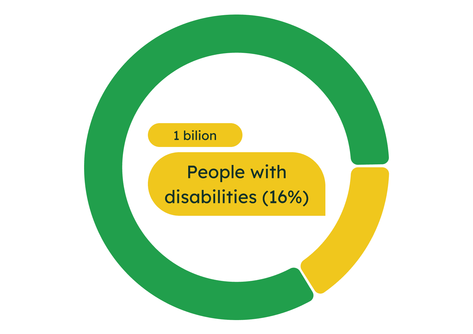
Over 1 billion people worldwide have disabilities, affecting their ability to use the internet.
Ignoring web accessibility means shutting out approximately 16% of the population. This is not just an ethical concern, but also a business opportunity.
At Codi.pro, we believe that internet is for everyone. Thus, we specialize in making web accessible for all, ensuring that every internet user feels respected and valued.
But, website accessibility can be achieved through 5 core optimizations.

4:5:1 color contrast ratio.
A 4:5:1 color contrast ratio significantly enhances website accessibility, particularly for visually impaired users (7.5% of the population). It improves text readability by offering clearer distinction between foreground and background colors.
Hierarchical content structure.
Using a well-organized content structure helps both users and screen readers navigate through information. This way, visitors can more easily and clearly understand your message.
Alt text added to the images.
Alt text provides image descriptions for those using screen readers. This means people with visual impairments (approx. 1 in 13 people) can still benefit from the graphics on the site, and it makes the content more visible in search engine results.
Enabled keyword navigation.
Enabling keyword navigation allows users to browse a website using keyboard shortcuts, making it possible to interact with your site to those with motor impairments (estimated 16% of population), such as Parkinson’s disease.
Responsive interface.
A responsive website adapts to various screen sizes, ensuring full usability on any device. Such sites rank better on Google, as accessibility is a key ranking factor.
WCAG 2.2 rules set benchmarks for website accessibility for all users.
-
BAD RESULT
<A tier (WCAG)
If the site doesn’t meet the criteria of WCAG 2.2. tier A standards, then it provides insufficient accessibility for users with disabilities. People with visual and motor impairments won’t be able to use your site.
-
GOOD RESULT
AA tier (WCAG)
The standards of AA WCAG 2.2. class ensure the website offers an inclusive and seamless experience for most people with disabilities.
-
BEST RESULT
AAA tier (WCAG)
Establishes the organization as a leader in digital accessibility and inclusivity, but is resource and effort consuming. Might not fit the budget capabilities and requirements of many companies.
Is your website sustainable, accessible, and compelling?
Send us a link to your website to get a free holistic audit report.
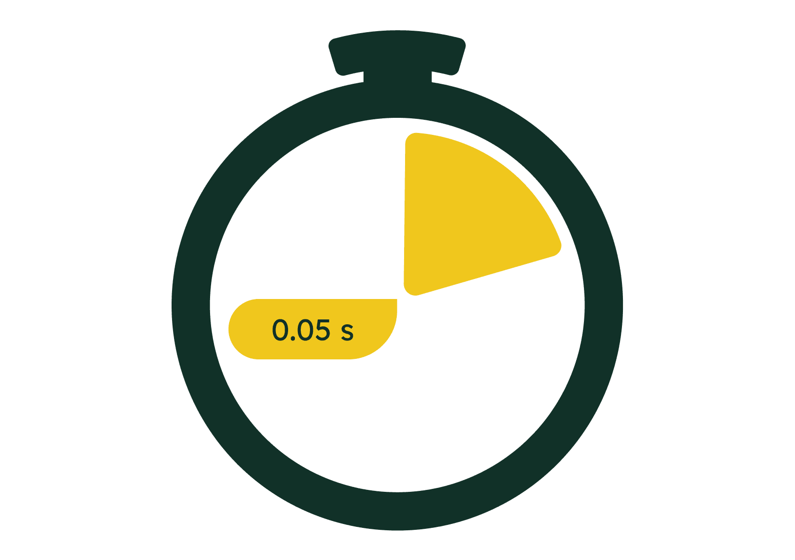
It takes 0.05 seconds for a potential customer to form their first impression.
At the beginning of the internet age, an average internet user in the United States visited 138 websites a day*. In 2023, that number is likely a lot higher.
Today, a typical user forms an opinion about the company in 0.05 seconds of seeing a website, and bases it primarily on the design.
This means, compelling website design and content is key in grabbing customers’ attention and making a lasting positive impression.
Creating great impression is possible with 5 design principles.

Layout with clear focal points.
A layout with clear focal points directs user attention to key content, enhancing user experience. Strategically placed visual elements guide visitors, ensuring important information stands out and is easily digestible.
Distinctive and self-contained color palette.
Employing a distinctive, self-contained color palette creates a cohesive and memorable brand identity. It ensures consistency across all pages, making the website visually appealing and instantly recognizable to users.
Limited number of legible font styles.
Using a limited number of legible font styles enhances content understandability by creating hierarchical consistency. This prevents reader distraction, aiding in the absorption and retention of information presented on the site.
Mobile-friendly interactive elements.
Optimizing interactive elements and navigation for mobile use ensures a seamless customer experience across devices. This approach facilitates easy access and engagement with content on smaller screens.
High-resolution stylistically consistent imagery.
Stylistically consistent imagery elevates the visual appeal of the website, creating a cohesive and professional aesthetic. It highlights brand identity and creates a distinctive memorable look.
Customer Effort Score (CES) shows if your site provides what the customers expect.
-
BAD RESULT
<3/5 (CES)
A customer effort score below 3/5 indicates significant challenges for users in finding necessary information, often leading to frustration and abandonment of the purchase process on the website.
-
GOOD RESULT
3.75/5 (CES)
Achieving a 3.75/5 score reflects a user-friendly experience, with most customers finding necessary information with ease.
-
BEST RESULT
5/5 (CES)
Attaining a perfect 5/5 customer effort score is extremely rare, as it's challenging to meet the diverse needs of every customer. Such a score signifies an exceptionally intuitive and user-friendly website.
Want to try our approach?
Request a free consultation, to get 3 tips on how to become more sustainable, accessible, and compelling for your customers.